Header
Description
The Header is the consistent, recognizable entry point across all DEHN web experiences, products, and portals. It combines brand presence (logo), portal-specific primary navigation, and a standardized utility area (icon menu). The concept is designed to be modularly customizable per portal while keeping navigation patterns and always-present elements consistent.
In its passive (collapsed) state, the Header consists of three core elements:

- Logo (left):
Always links to the home page of the current portal, context, or product. Logo usage follows the logo guidelines. - Main menu (center):
Portal-specific primary navigation, ideally 3–5 top-level items, supporting up to two levels of navigation where needed. Read more on header-menu - Icon menu / utilities (right):
Standardized entry points (e.g. Search, User, International, Shopping). Icons never trigger actions directly — they always open the corresponding panel area first.
Sticky & scroll state
The header is always sticky — it remains visible at the top of the viewport at all breakpoints and in all portal contexts. Two visual states apply:
| State | Trigger | Visual treatment |
|---|---|---|
| Initial | scroll = 0 | No shadow, no blur — the header reads as an integral part of the page |
| Scrolled | scroll > 0 | Subtle drop shadow + minimal transparency and backdrop blur signal elevation |
--dehn-white-transparent: rgba(255, 255, 255, .95);
background-color: var(--dehn-white-transparent);
backdrop-filter: blur(8px);
The transition is deliberately subtle — the header bar height and content remain unchanged in both states.
Open state
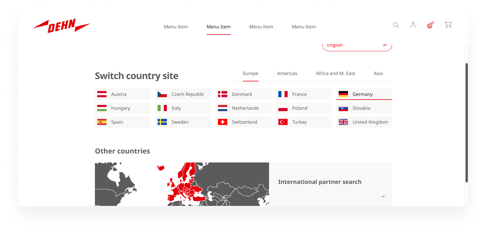
The header enters an open state whenever a panel or the main menu is active:
- Open/close pattern: A menu or panel opens when its trigger is clicked or tapped, and closes when the same trigger is activated again, when the user presses
Escape, or when a different panel is opened. Only one panel can be open at a time. - Backdrop overlay: When the header is open, the remaining visible viewport is covered by a black semi-transparent overlay with a blur effect. Clicking the overlay closes the header.
--dehn-eerie-transparent: rgba(31, 31, 30, .95);
background-color: var(--dehn-eerie-transparent);
backdrop-filter: blur(8px);
- Overflow: If the content within an open panel exceeds the available viewport height, the content area becomes vertically scrollable. The header bar itself stays fixed at the top.
Responsive behavior
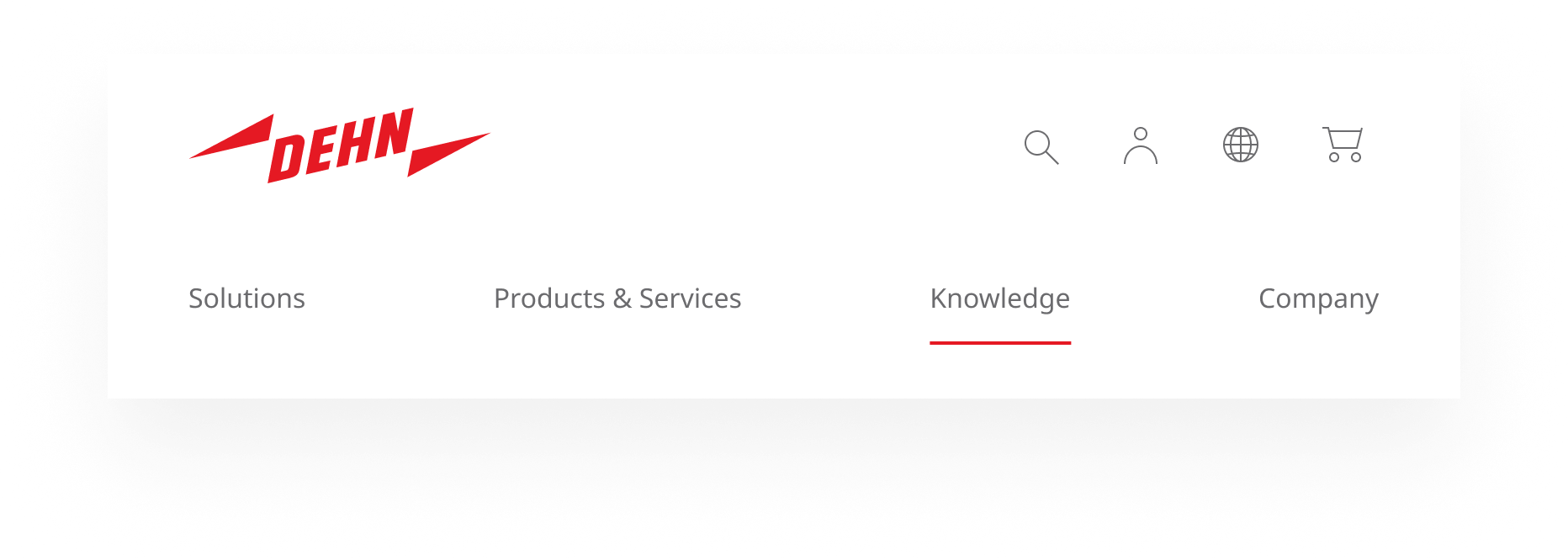
The header adapts fluidly across screen sizes with two possible breakpoints:
- First breakpoint: The main navigation shifts into a second row below the logo and icon bar.
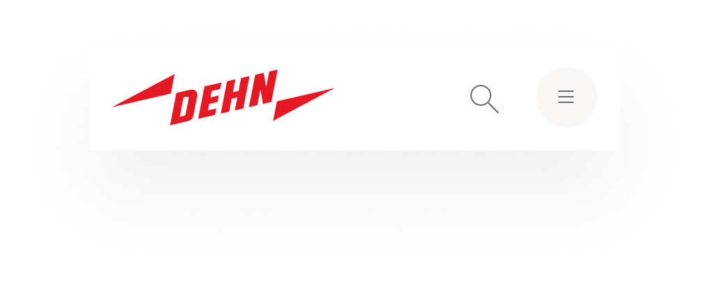
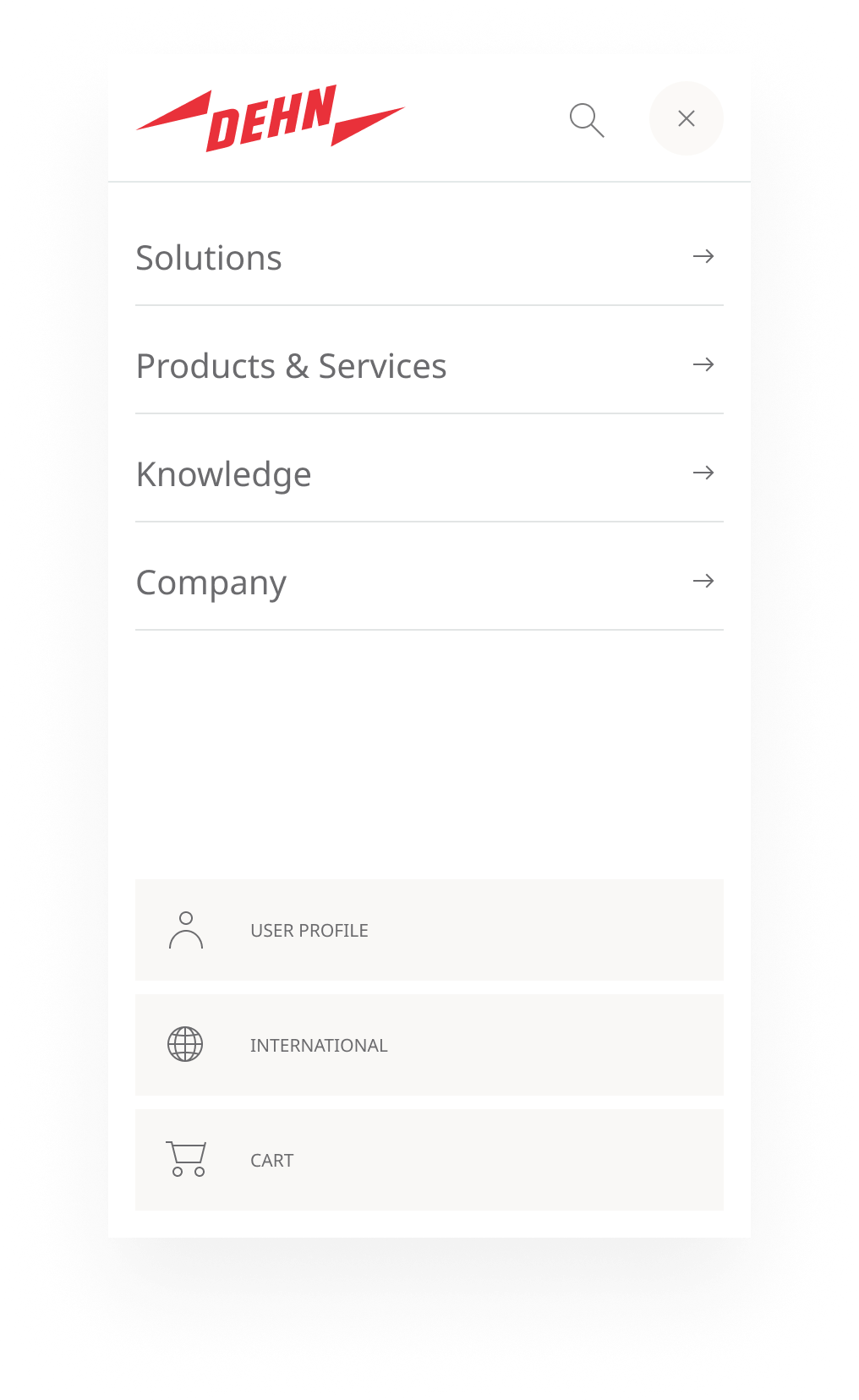
- Second breakpoint: The navigation collapses entirely. Only the logo, the search icon, and a burger menu icon remain visible. Opening the navigation reveals all main menu items as a vertical list. The remaining utility icons appear at the bottom of the open navigation panel.
Usage
Rules & Guidelines
Logo: Always use as the primary brand anchor and Home link. Usage follows the logo guidelines.
Main menu: Prefer 3–5 top-level items. Supports direct links (flat structures) and expandable navigation (flyout) for more complex structures. Further details: Header Menu.
Icon order: Search → User → International → Shopping . This fixed sequence applies in the header bar and wherever the icons are presented together. Consistency of order takes precedence over any portal-specific prioritization.
Icons are entry points, not direct actions: An icon button must not immediately navigate, submit, or trigger an irreversible action. It always opens the header panel first and provides explicit, labeled controls inside.
Only one panel at a time: Opening a new panel automatically closes the currently open one.
Panel-specific documentation:
- Header Menu — Main navigation and flyout concept
- Header Search — Search panel with live results
- Header User — User context and account actions
- Header International — Country and language selection
HTML Structure
<header>
  <a href="#main-content" class="skip-link" hidden>Skip to main content</a>
  <div class="header-content">
    <a href="/" aria-label="Home">
      <!-- Logo component -->
    </a>

    <nav aria-label="Primary">
      <!-- Main menu as a list; expandable items are buttons controlling panels -->
      <ul>
        <li><a href="/section-1">Direct link</a></li>
        <li>
          <button aria-expanded="false" aria-controls="panel-section-2">
            Flyout trigger
          </button>
        </li>
      </ul>
    </nav>

    <nav aria-label="Utilities">
      <button aria-expanded="false" aria-controls="panel-search" aria-label="Search">
        <!-- Search icon -->
      </button>
      <button aria-expanded="false" aria-controls="panel-user" aria-label="User account">
        <!-- User icon -->
      </button>
      <button aria-expanded="false" aria-controls="panel-international" aria-label="Country and language selection">
        <!-- Globe icon -->
      </button>
      <button aria-expanded="false" aria-controls="panel-shopping" aria-label="Shopping cart">
        <!-- Cart icon -->
      </button>
    </nav>

  </div>
  <div id="panel-container" class="flyout-container" hidden>
  <!-- Utility panels (hidden/collapsible regions) -->
    <div id="panel-section-2" hidden><!-- Section 2 menu --></div>
    <div id="panel-search" hidden><!-- Search panel --></div>
    <div id="panel-user" hidden><!-- User panel --></div>
    <div id="panel-international" hidden><!-- International panel --></div>
    <div id="panel-shopping" hidden><!-- Shopping panel --></div>
  </div>
</header>
Accessibility
- Skip link: Include a visually hidden
<a href="#main-content" class="skip-link">Skip to main content</a>as the first focusable element inside<header>. It becomes visible on focus and allows keyboard and screen reader users to bypass the navigation entirely. - Landmarks: Wrap the component in
<header>. Use<nav aria-label="Primary">for the main menu and<nav aria-label="Utilities">for the icon menu. - Focus order: Skip link → Logo → Main menu → Utilities.
- Buttons vs. links: Use
<a>for navigation destinations,<button>for toggle elements (icons and expandable menu items). Every icon button must have an accessible name (e.g.,aria-label="Search"). - Expanded panels: Set
aria-expanded="true|false"andaria-controls="…"on every toggle. When opening a panel, move focus to the first interactive element inside it. When closing, return focus to the triggering control. - Keyboard: All header functionality must be reachable by keyboard alone (Tab/Shift+Tab). Expand/collapse with Enter/Space. Panels close with
Escape. Submenus must not require hover to be usable. - Visual: Clearly visible focus indicator on all interactive elements. WCAG AA contrast: 4.5:1 for text, 3:1 for UI elements. Sufficient tap target size for icon buttons.
- Language: If the International panel changes the language, the
langattribute of the page must be updated programmatically. - Validation: Automated checks (Lighthouse) and manual testing (keyboard-only, screen reader smoke tests with NVDA/VoiceOver, 200% zoom, high-contrast mode) in acceptance criteria. Also applicable under the Barrierefreiheitsstärkungsgesetz (2025).