Header User
Description
The user panel provides access to account-related content and actions — authentication, profile management, and DEHN service links, directly from the header. Panel content adapts dynamically based on the user’s authentication and role status.
The panel is primarily defined for the Web & Commerce context. In app contexts, the content may differ: fewer outbound links (users stay in flow), and potentially more personal settings such as notifications, preferences, or display language.
Use Cases
- When a portal supports user authentication and needs an accessible entry point for login and account management.
- When a logged-in user needs to see their identity context (name, company, customer number).
- When DEHN services relevant to the user’s role should be surfaced in a consistent location.
- When users without a webshop role should be guided toward requesting access.
Usage
Rules & Guidelines
Panel variants (Web & Commerce):
Panel content varies by authentication and role status. Three states apply:
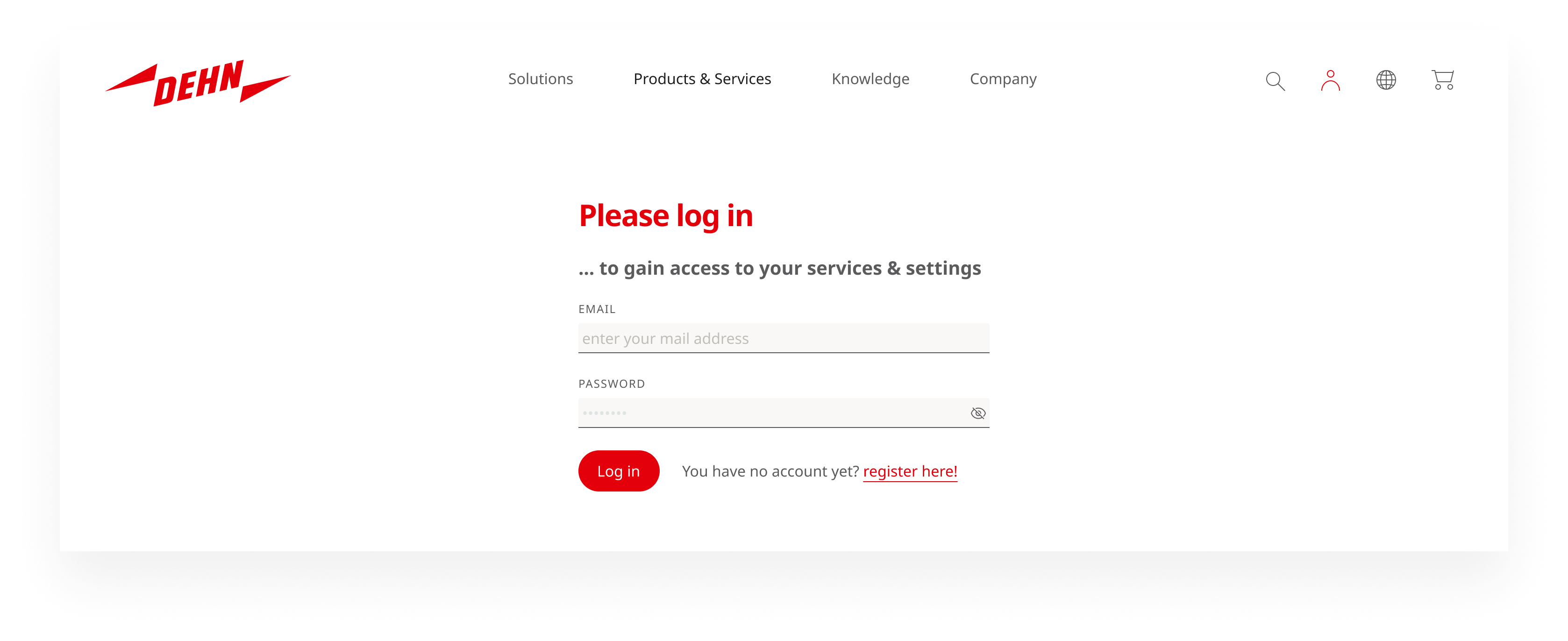
1 — Not logged in
The goal is to invite login without blocking. Registration is offered as a secondary path.
- Primary action: Log in (button)
- Secondary: Link to registration
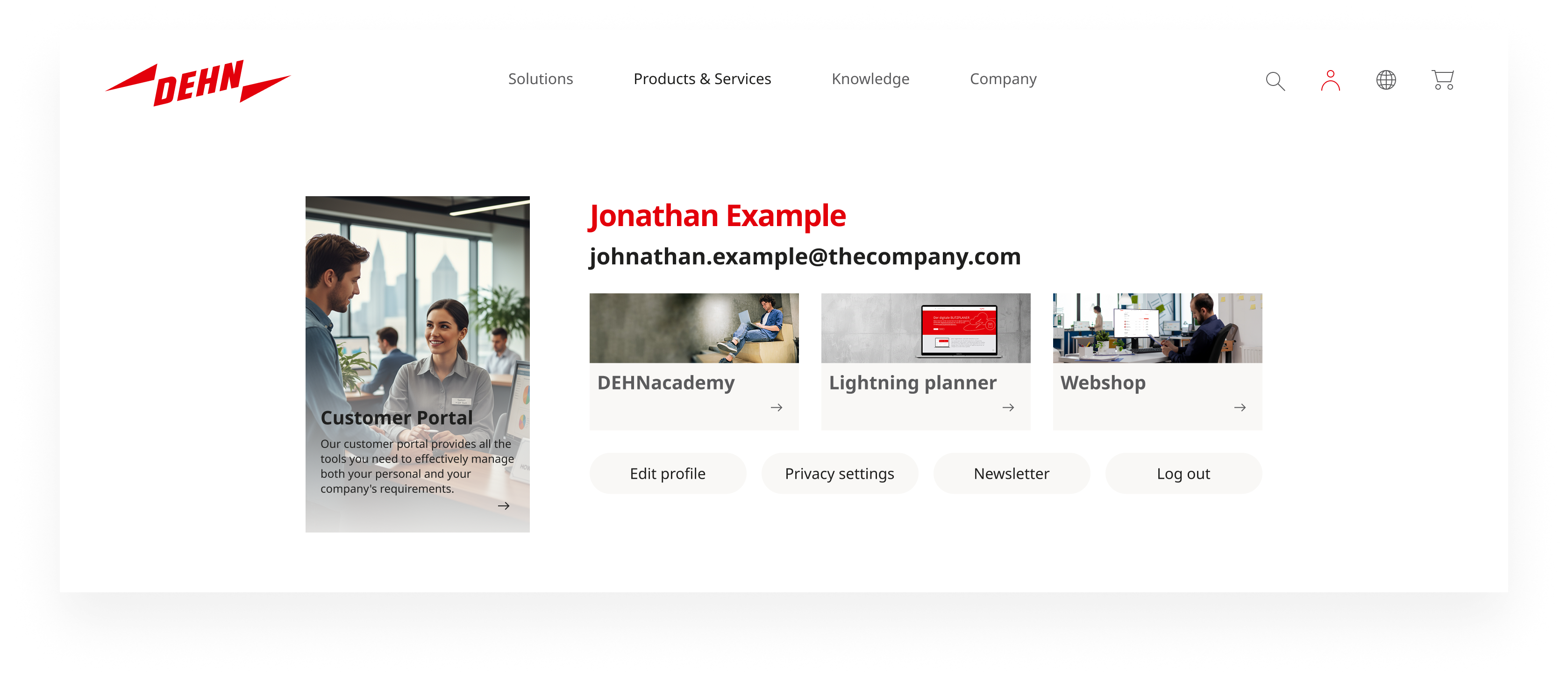
2 — Logged in, no webshop role
The user is authenticated but not linked to a company with a webshop customer number. They have access to general DEHN Digital Services, but not to ordering functionality.
- Name and email address at the top
- Teasers to available DEHN services (content varies per user and portal)
- “Request webshop access” teaser — clearly visible but non-intrusive
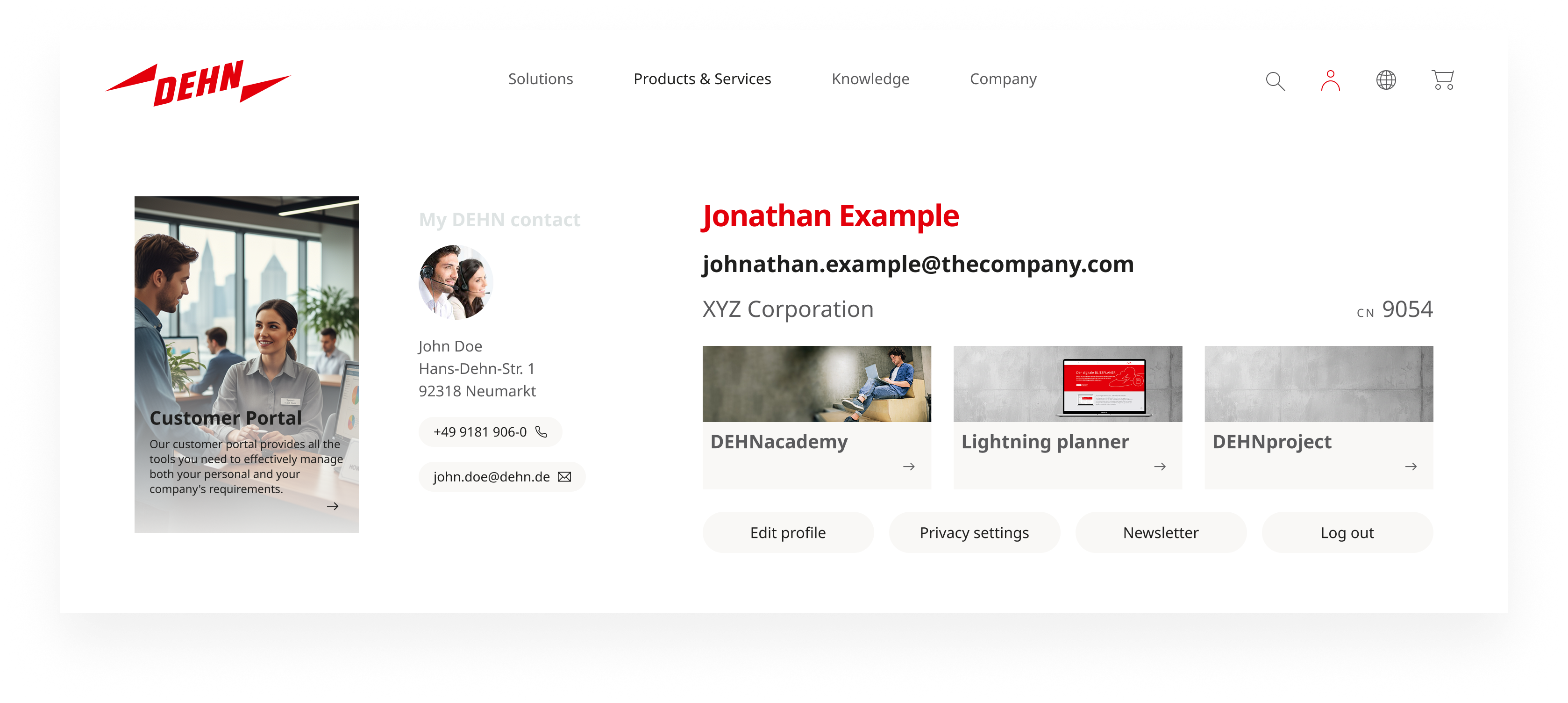
3 — Logged in, with webshop role
The user is linked to a company registered as a DEHN webshop customer (with customer number). This is the most feature-rich state.
- Name and email address at the top
- Company name + customer number (provides orientation and confirms business context)
- Teasers to available DEHN services
- Personal DEHN contact information (dedicated sales or key account contact)
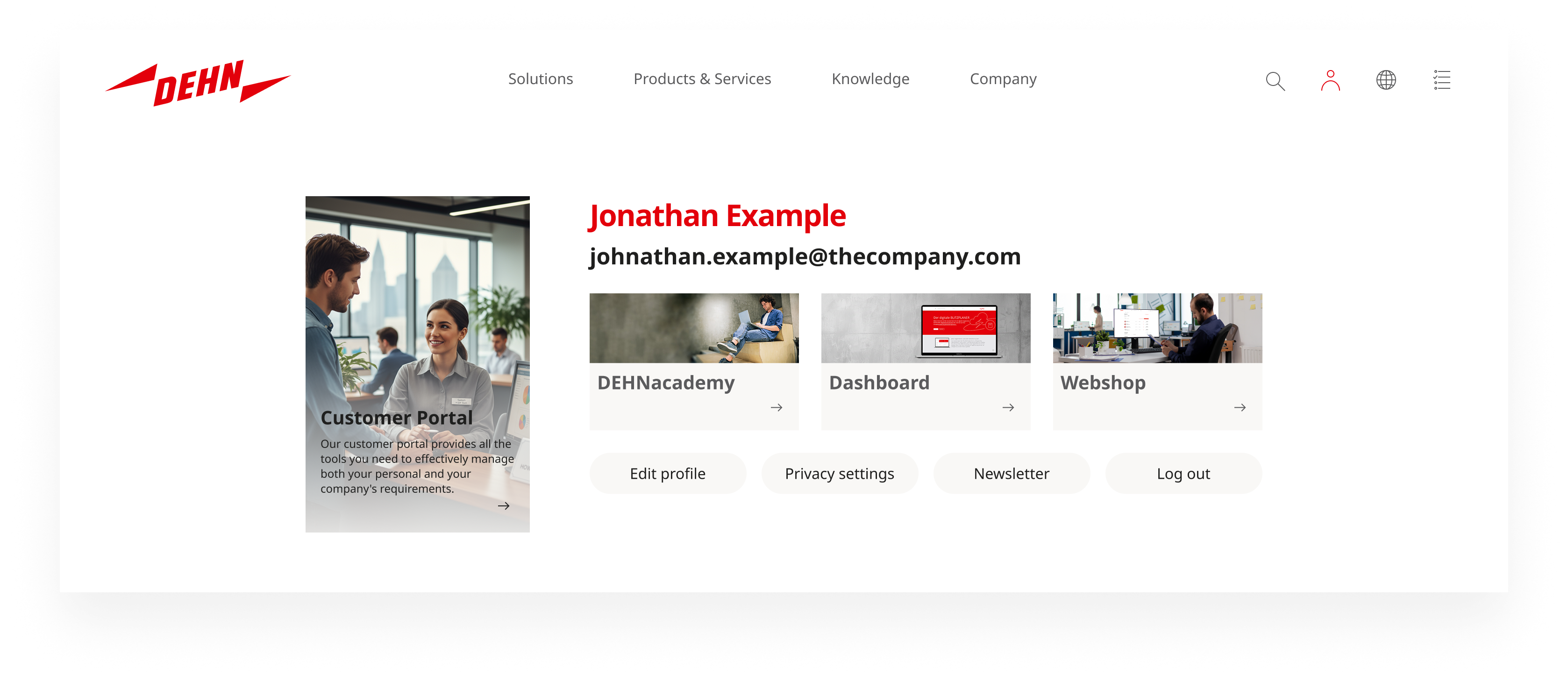
Implementation status: The panel variants above represent the target state. As long as a dedicated Customer Portal start page does not yet exist, the user panel may include a teaser linking directly to the Dashboard as a transitional measure. Once such a start page is available, the dashboard teaser should be replaced accordingly.
Context variants: In app contexts, an adapted panel is appropriate — fewer outbound links, more personal settings. Webshop-specific CTAs are not relevant where commerce is not part of the product.
Accessibility
- Focus management: When the panel opens, focus moves to the first interactive element inside it (e.g., login button or first service link). When the panel closes, focus returns to the user trigger button.
- ARIA:
aria-expandedandaria-controlson the trigger button. State changes (logged in/out) must be perceivable by screen readers — e.g., viaaria-live="polite"on the panel container. - Keyboard:
Escapecloses the panel (focus returns to trigger). Tab navigates through all interactive elements in the panel. All actions (login, logout, links) are reachable with Enter. - Semantics: Login button as
<button>or<a href="/login" class="btn">. No purely visual status indicators without a text alternative. - Contrast: WCAG AA: 4.5:1 for text, 3:1 for interactive states. Names and email addresses must be readable in degraded display conditions.
- Validation: Manual testing with NVDA and VoiceOver for all three authentication states. Lighthouse audit. Applicable under the Barrierefreiheitsstärkungsgesetz (2025).