Header Menu
Description
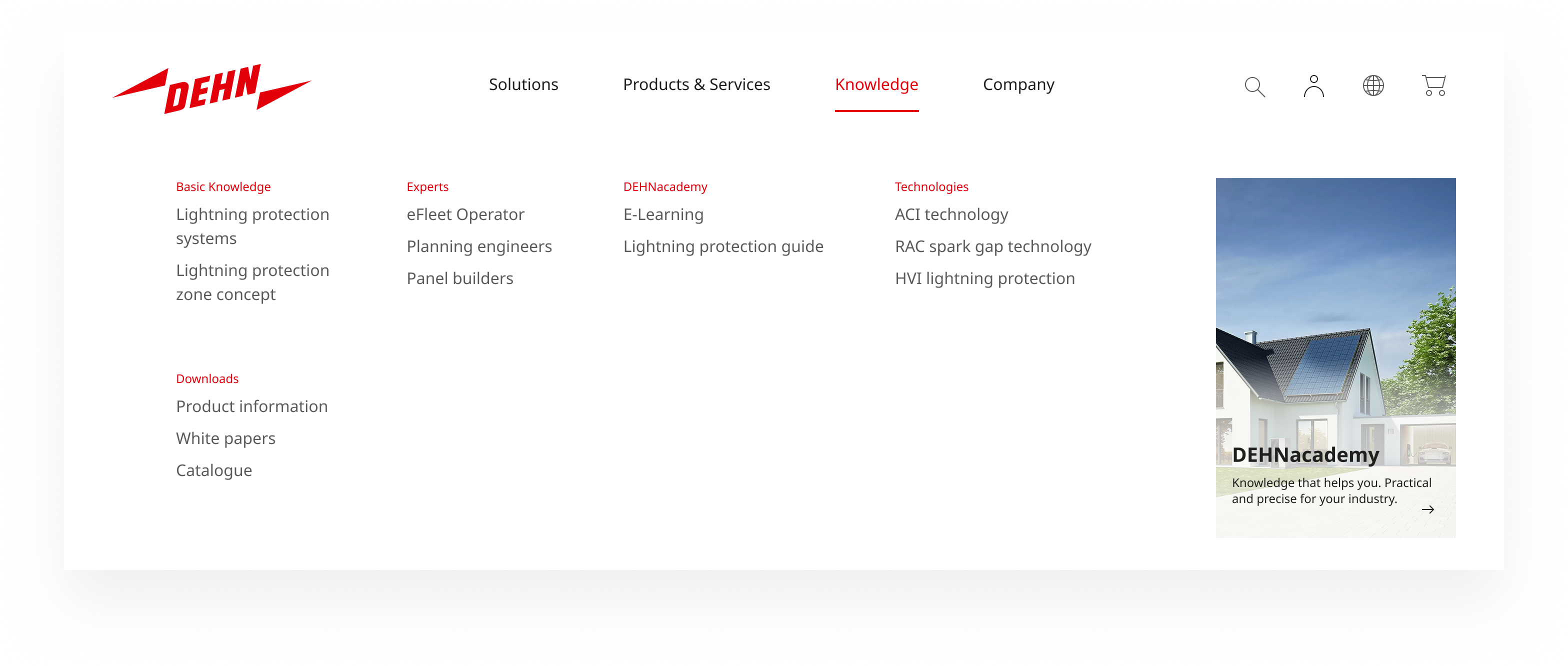
The header menu is the portal-specific primary navigation in the DEHN header. It ideally consists of 3–5 top-level items and supports — depending on the depth of the information architecture — either direct links to destination pages or a flyout panel with up to two levels of navigation.
The two-level (three in total) limit is intentional: a deeper navigation hierarchy is a signal that the information architecture should be revised, not a reason to add a third flyout level.
Usage
Rules & Guidelines
Variants:
- Direct link: Top-level items link directly to their destination page without opening a flyout. Appropriate when the information architecture does not require grouping.
- Flyout menu: Top-level items open a panel exposing up to two levels of navigation. Default variant for dehn.de and content-rich portals.
Flyout structure:
- Category level (Level 1): Group headings that bundle related content. Each heading is also a link to a category overview page, giving users a direct route to the broader section.
- Link level (Level 2): Individual navigation links listed beneath each category heading — the actual destinations users navigate to.
- Teaser (optional): An editorial area — typically to the right of the navigation columns. Three visual variants: photo, colored surface with product image, or text only. The teaser is configured per portal and per top-level menu item.
Open/close behavior:
- A flyout opens when the user clicks or taps the corresponding top-level item — not on hover. This ensures consistent behavior across pointer and touch devices.
- Closes when: the same top-level item is clicked again, the user clicks outside the header, or
Escapeis pressed. - Opening a different top-level item closes the current flyout and opens the new one in a single interaction.
Active/current state: The menu item corresponding to the user’s current page is marked as active — on both the top-level item and, where applicable, the second-level link. The active state is visually distinct from default and hover states and persists regardless of whether the flyout is open.
Responsive Behaviour
Desktop: The flyout spans the full width of the header and presents all category headings and their links in a clear column layout alongside the teaser.
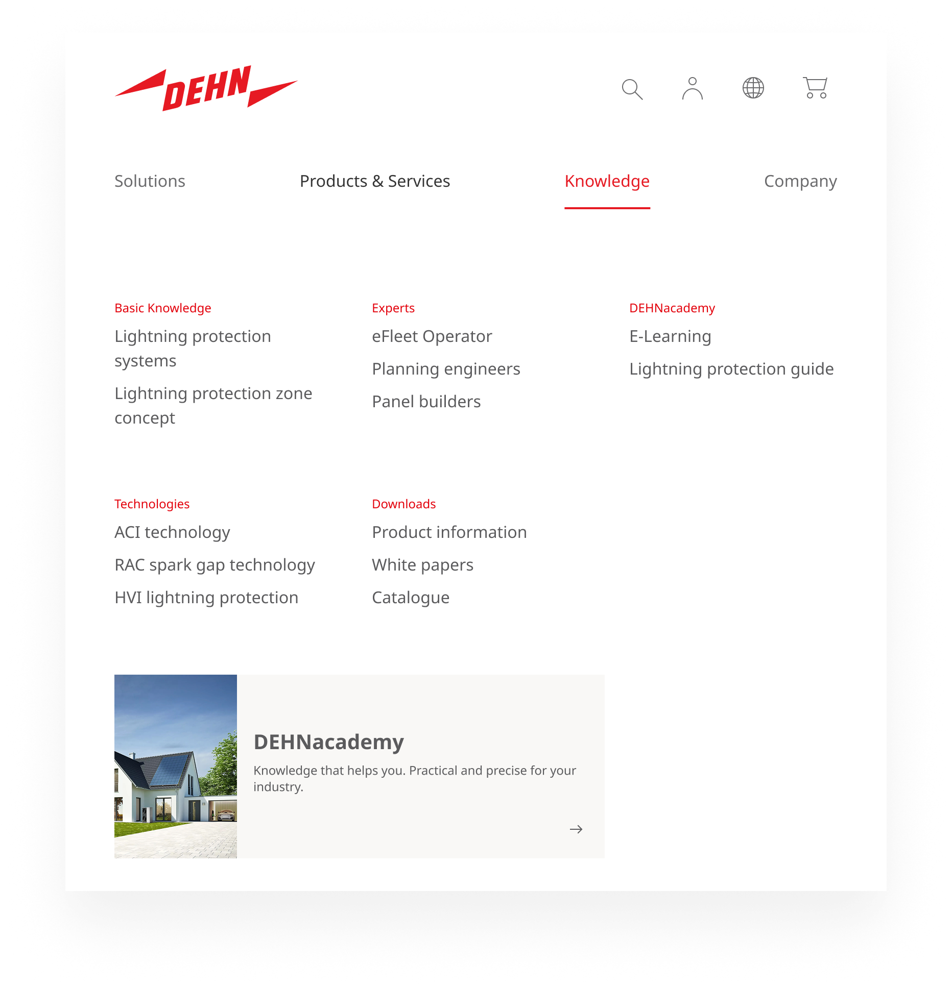
Tablet: As the viewport narrows, the flyout adapts by stacking the category columns vertically, giving each category and its links more room without horizontal compression. The teaser is retained.
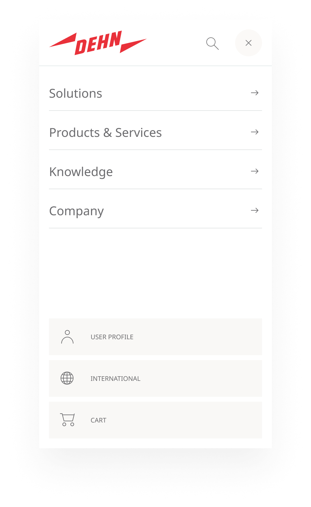
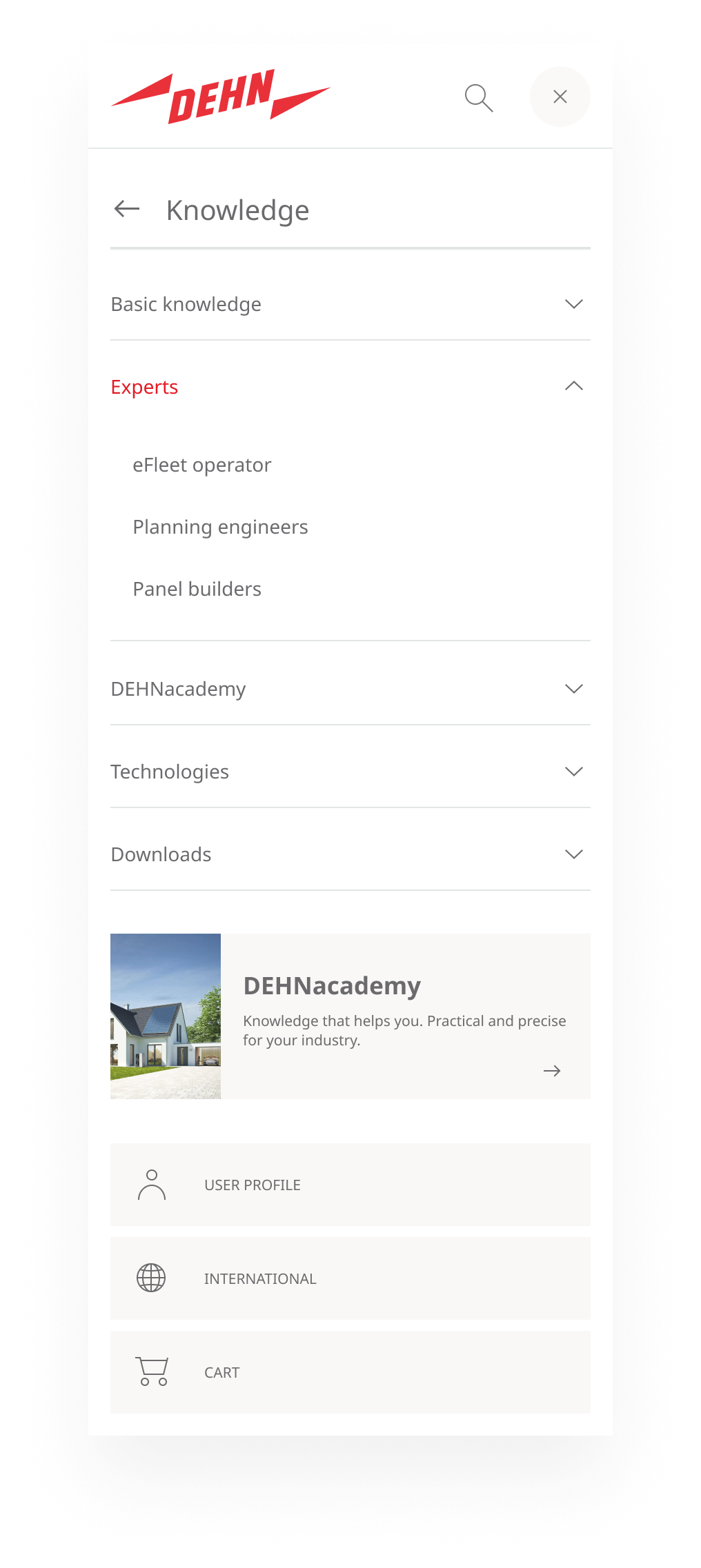
Mobile: The navigation collapses into a full-panel overlay. The interaction follows a sequential flow: the overlay shows all top-level items as a vertical list (items with subnavigation indicated by a forward arrow); tapping one navigates into it, showing the section with a back arrow at the top; subcategories expand as accordion items with the teaser at the bottom; the back arrow returns to the top-level list.
Accessibility
- ARIA:
aria-expandedandaria-controlson every toggle button.aria-haspopup="true"communicates to screen readers that a flyout follows.aria-current="page"on the active link. - Keyboard: Tab navigates through top-level items. Enter/Space opens and closes flyouts. Within a flyout, the tab order is: category headings → links → teaser.
Escapecloses the open flyout and returns focus to the triggering button. - Focus management: When a flyout opens, focus moves to the first link inside it. When it closes, focus returns to the triggering top-level button.
- No hover-only: Flyouts must only be triggered by click/tap — never by hover alone.
- Contrast: WCAG AA: 4.5:1 for link text, 3:1 for interactive states (hover, active, focus indicator).
- Validation: Keyboard-only testing across all flyout interactions; screen reader testing with NVDA and VoiceOver. Lighthouse audit.