Header Search
Description
The search panel provides portal-wide search access from anywhere within the header. It opens as an expanded panel below the header bar — consistent with how all other utility panels behave. When opened, the input field receives focus automatically, so users can begin typing immediately without an additional interaction.
The search is intended as a “global” portal search. A highly context-specific search (e.g., within a product listing) belongs in the content area, not in the header.
Usage
Rules & Guidelines
States:
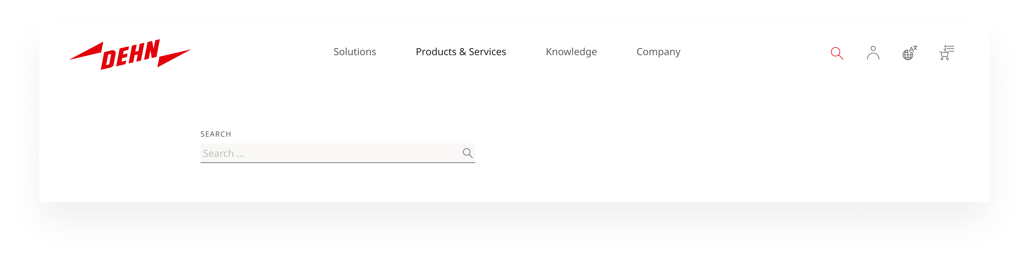
- Empty state: When first opened, the panel shows only the search input field. No results or suggestions are displayed until the user begins typing.
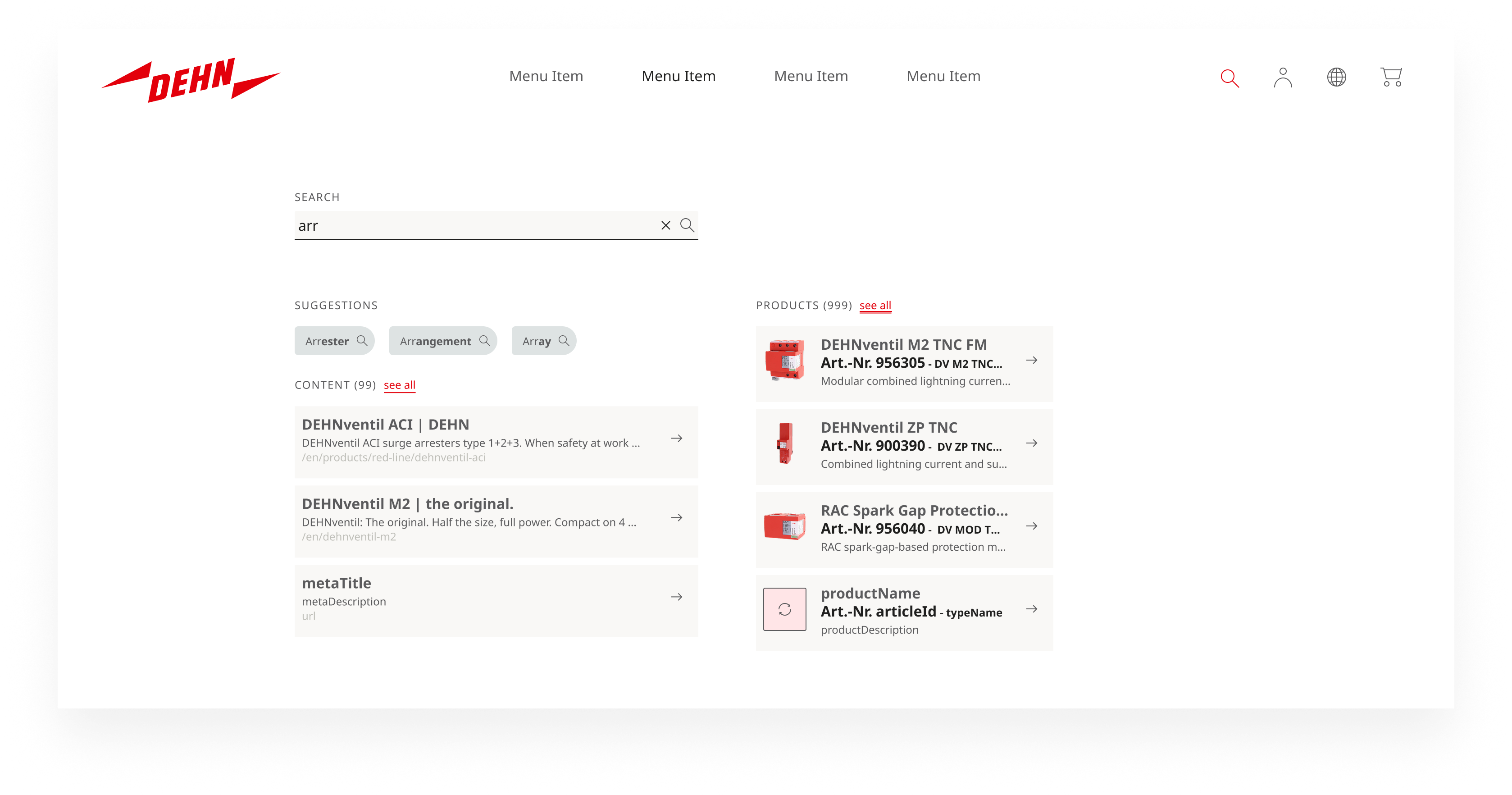
- Active state — live results: As the user types, the panel expands to show live results in two columns: content results on the left, product results on the right. Above the content results, keyword suggestions appear as chips for quick query refinement. Each column shows a limited preview with a “See all” link to the full search results page.
- No-results state: If the query returns no matches, a clear message is shown. Helpful fallback content may be displayed (e.g., spelling suggestions, related category links) — but only if it is clearly labeled as such and cannot be mistaken for actual search results.
TODO
Result types (live results):
| Type | Fields shown |
|---|---|
| Products | Product name, article number + type name, short description |
| Content | Page title, meta description |
| Documents (planned) | To follow once technical indexing is available |
Article number search: When a user searches for a known article number, they should be taken directly to the corresponding product page. If the article number no longer exists, successor articles should be shown with an explicit notice that a replacement was found. This applies both in the live results panel and on the search results page.
Search results page: After submitting a query (via Enter or “See all”), the header panel closes and the user is taken to the full search results page.
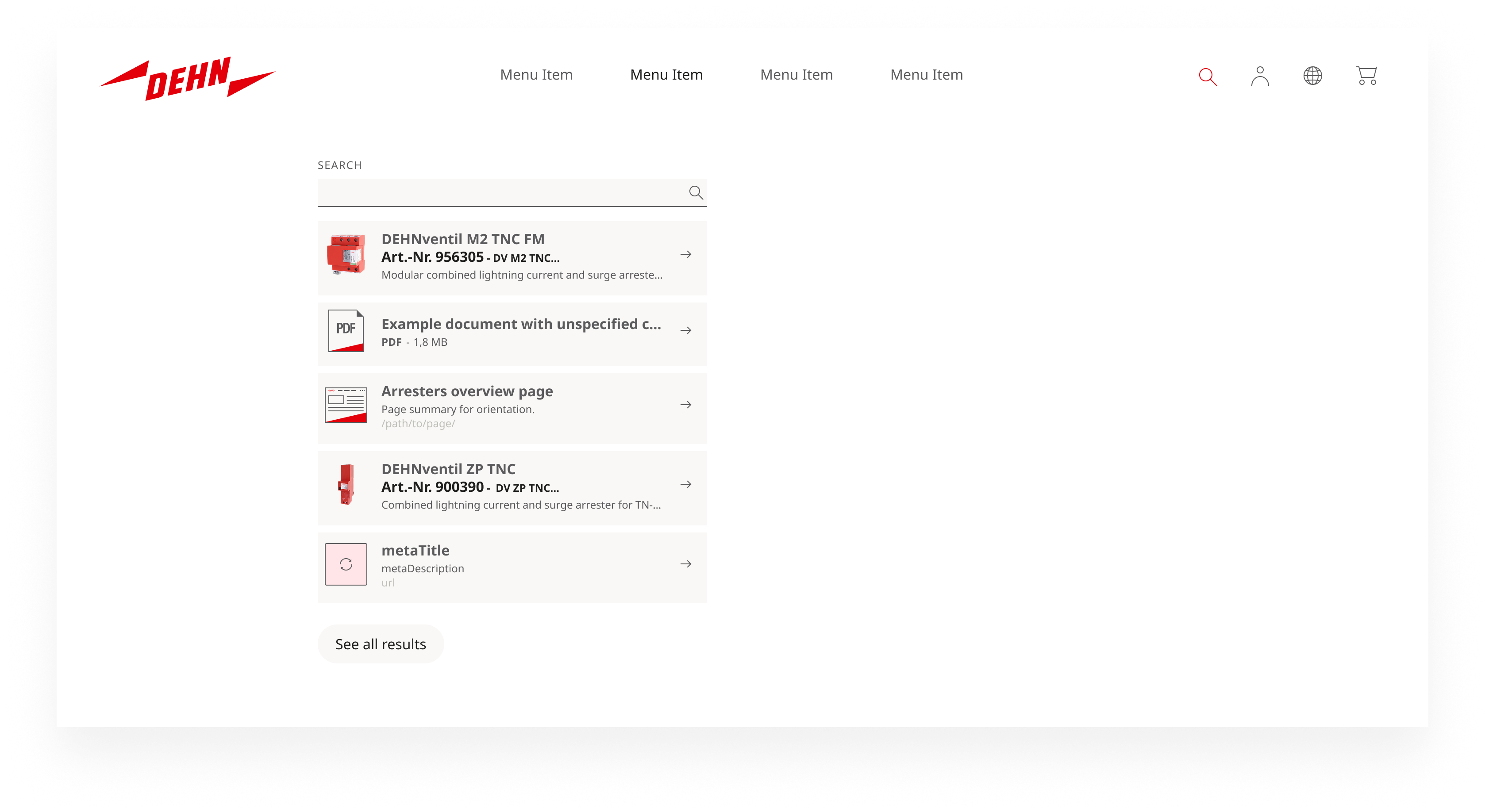
Implementation status: The live-results concept described above — two columns, keyword chips, product previews — is the target state. The current implementation is simplified: it provides the search input within the expanded header and basic suggestions, but does not yet include the split content/product columns or keyword chips. The target state will be rolled out in a subsequent iteration once the underlying search infrastructure supports it.
Responsive behaviour
The search panel adapts across breakpoints in line with the overall header responsive behaviour.
Tablet: The two-column live results layout is retained, but adapts to the reduced available width. The keyword chip row and both result columns remain visible.
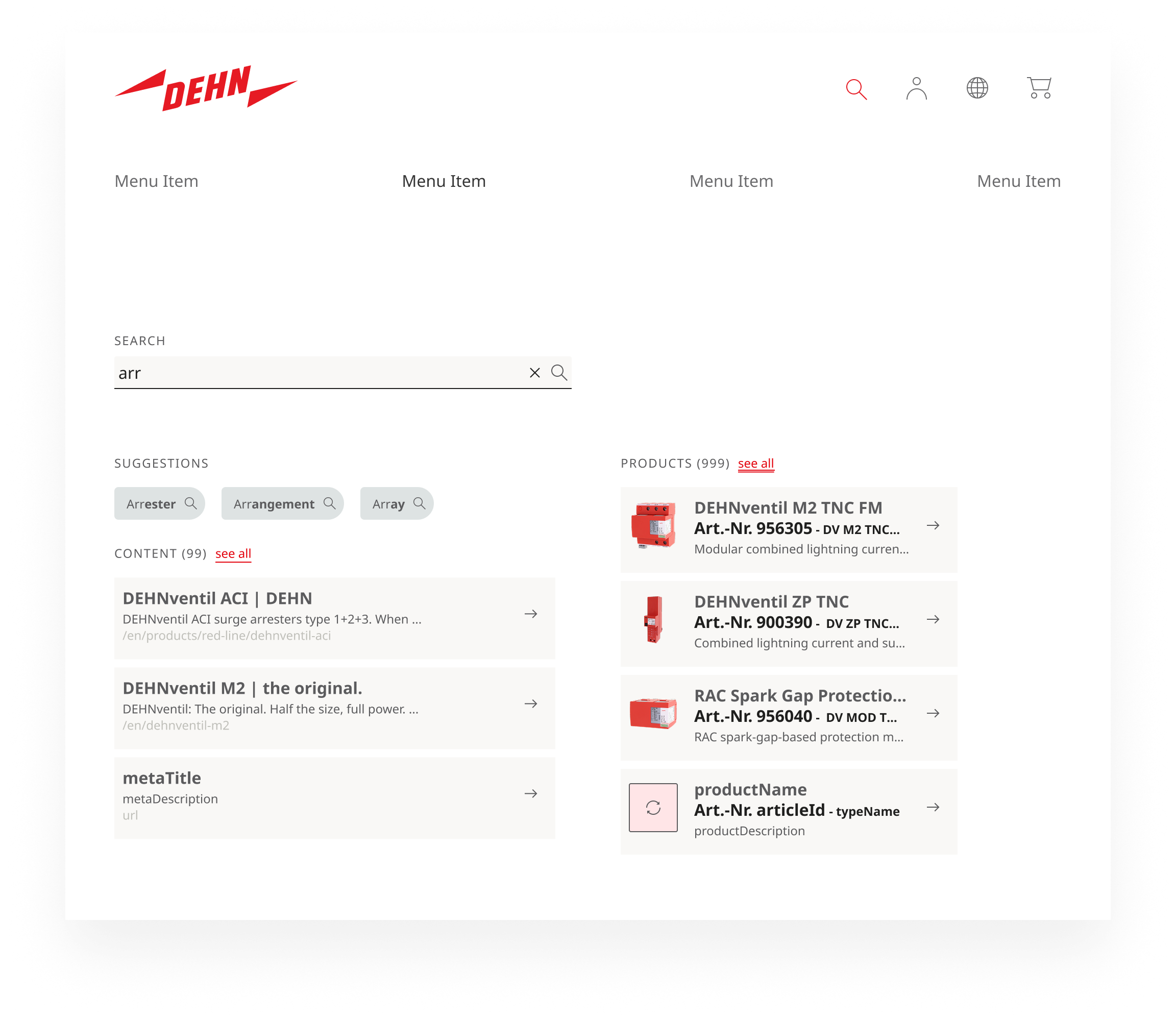
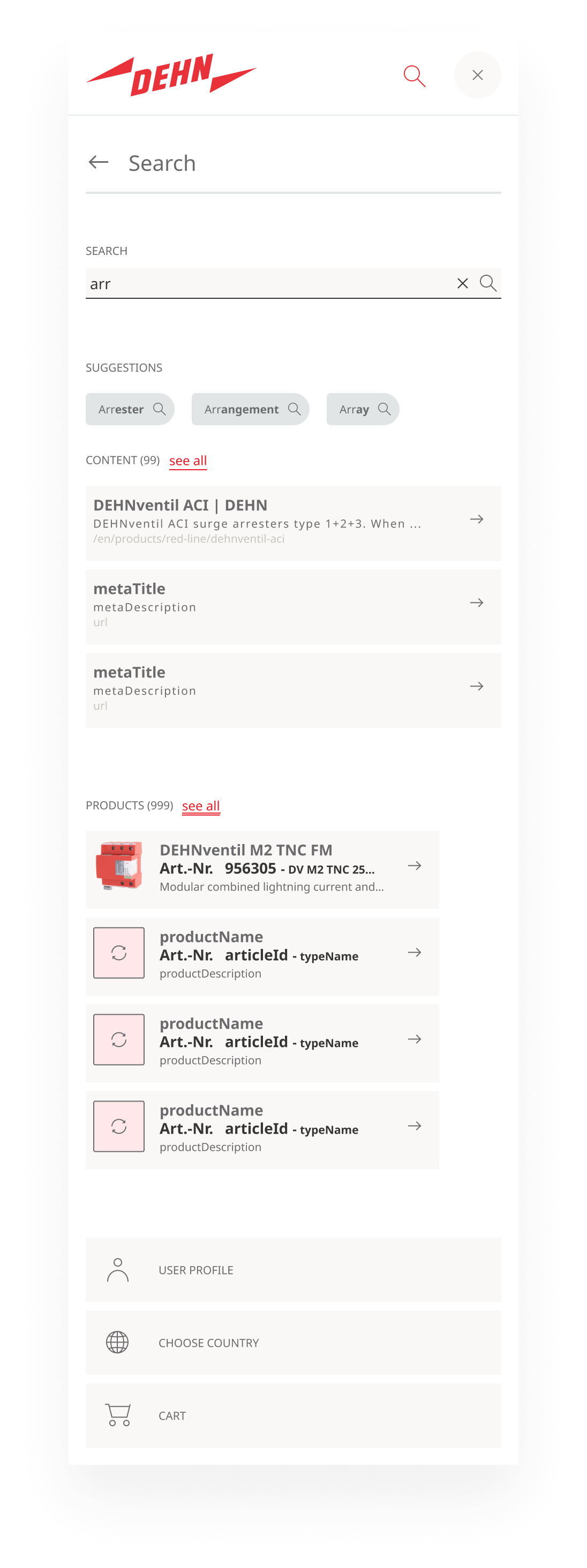
Mobile: The two-column layout collapses into a single scrollable list. Results are stacked vertically in this order: keyword suggestions → content results → product results.
Accessibility
- Focus management: When the panel opens,
#search-inputreceives focus automatically. When the panel closes, focus returns to the search trigger button. - ARIA:
role="search"on the panel container.aria-autocomplete="list"andaria-controlson the input for live suggestions.aria-expandedon the trigger button. - Keyboard:
Escapecloses the panel (focus returns to trigger). Tab navigates through chips and result links. Enter submits the search or activates a suggestion. - Screen reader: Announce result updates with
aria-live="polite"without interrupting the user. The “no results” message must be perceivable by screen readers. - No hover-only: All suggestions and results must be reachable by keyboard.
- Contrast: WCAG AA: 4.5:1 for text in results and chips, 3:1 for borders and interactive states.
- Validation: Lighthouse audit and manual testing with NVDA and VoiceOver; particular attention to dynamically injected content. Applicable under the Barrierefreiheitsstärkungsgesetz (2025).