Combobox
Description
The combobox lets users type to filter or choose an option from a dropdown list. It combines the features of an input and a select field, making it ideal for long lists where search helps users find what they need faster.
If it comes with a label, this is usually above the combobox and has our label formatting.
Use Cases
- Use when: There are many options, and search improves usability.
- Good for searchable dropdowns or dynamic forms.
- Avoid when: There are only a few options – use a select field instead.
Usage
Labeling: Always pair the combobox with a visible and programmatically associated <label>. This is essential for accessibility and helps screen reader users understand the purpose of the input. Keep the label in view when the select field is open.
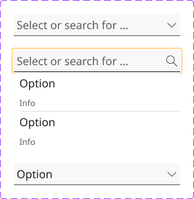
Input Placeholder: Use clear instructional placeholder text such as “Select or search for ...” to guide the user, especially if no separate label is present. Avoid using placeholders as a substitute for labels unless absolutely necessary.
First Option: The first option for comboboxes can be either none or a default value.
Icon Behavior: Default state shows a chevron-down icon. On focus, the icon changes to a search icon to indicate the input is active. After selection, the icon reverts to chevron-down.
Dropdown Behavior: Show filtered results dynamically as the user types. Highlight matching results and ensure keyboard navigation with arrow keys. Use visual grouping if necessary (e.g., info text under options). Automatically close the dropdown on selection.
Content: Keep options concise, meaningful, and relevant. If available, show additional context or descriptions beneath each option. Alphabetical order for things like country names. Logical grouping e.g., "Small, Medium, Large" instead of a random order. Most common choices first for faster selection.
Cascading Select Fields: If one select field affects another (e.g., Country → State/Province), dynamically load relevant options. Ensure the second select field is disabled until the first is selected. If the combobox triggers dynamic content or changes the page state, announce it using ARIA live regions for screen readers.
Selection: Populate the input field with the selected value. Hide the list of options. Revert icon to chevron-down.
Keyboard Navigation: Tab to focus the input, Arrow Down/Up to navigate options, Enter to select an option, Esc to close the dropdown
Visible Focus States: Use clear focus indicators for both the input and options, ensuring usability for keyboard and screen reader users.
Contrast and Visibility: Ensure that the combobox element, including its options, meets the minimum contrast ratios for text against its background to aid users with visual impairments.
Responsive Behavior: On smaller screens, ensure the dropdown does not get clipped or obstructed. Support zoom/responsive text resizing up to 200% without loss of content or functionality.
Example