Range Slider
Description
A range slider allows users to select a range of values by dragging two handles along a track. Range sliders are ideal for approximations, filtering, and interactive adjustments where a minimum and maximum boundary are more useful than a single input.
Use Cases
- Filtering results within a set range (e.g., price range, age range).
- When exact precision isn’t required but approximate boundaries are helpful.
- For visualizing and adjusting a spectrum of choices rather than typing numeric inputs.
- For dynamic filtering where quick adjustments improve exploration (e.g., "Show items priced between 50 € and 500 €").
When Not to Use
- When users must select a single, precise value.
- For non-continuous options (e.g., categories or predefined choices).
- If the numeric range is extremely large or extremely small, making slider movement imprecise.
- For accessibility-critical inputs where precise control is required.
Usage
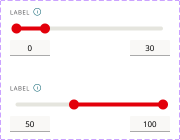
Labels: Always display minimum and maximum values for context. Show both selected values dynamically as users adjust the handles. Include units, symbols, or separators (e.g., currency, commas).
Defaults: Set a reasonable default range instead of forcing users to adjust from extremes. Defaults should reflect common user needs (e.g., set a default price range based on average costs).
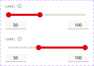
Handles: Use two handles (for minimum and maximum). Prevent overlap or ambiguous selections. Ensure that the active selection range is visually distinct from the inactive range.
Increments: If values should only increase in fixed amounts, set a step (e.g., 5, 10, or 50 units at a time). Avoid overly small increments (e.g., 1 € steps on a 10,000 € range can be frustrating).
Keyboard Interaction: Ensure the slider works with keyboard navigation (Tab to select, Arrow keys to adjust).
Accessbility: Some users may struggle with dragging - provide a number input or select field alternative. Let users click anywhere on the track to move the handle instead of forcing drag interactions.
Feedback: Use small animations when sliding to improve responsiveness. Change colors dynamically when users adjust values to reinforce selection. Provide vibration feedback on mobile for better interaction.
Example