Forms
The Forms chapter is dedicated to the essential building blocks of user interaction: form elements. This section covers everything needed to construct clear, user-friendly forms, from input fields and checkboxes to dropdowns and sliders. Each guideline ensures our forms are intuitive, efficient, and seamlessly integrated with the overall user experience, facilitating easy and accessible data entry across our digital platforms.
Organizing Forms
-
Keep forms as short as possible by only including essential fields. Minimize the number of fields to reduce user effort and improve completion rates. Use progressive disclosure to show only relevant fields at a given time, such as revealing additional fields based on user input.
-
Organize fields into meaningful sections based on their purpose, such as “Personal Information” and “Billing Details.” Place related fields close together, such as grouping “First Name” and “Last Name” under “Name.” Such fields can be placed next to each other.
-
Break long forms into manageable steps and include progress indicators such as loading icons to help users understand how far along they are. Steps can also be on a single page. 14, 15
-
Use logical sequencing. Stick to standard sequences (e.g. placing first name before last name, and email before phone number) but also consider usage frequency (e.g. radio button for standard shipping before express shipping), and list the most common values first (e.g. +49 for country codes) when possible. 31
-
Allow users to easily scroll back to previous sections without losing data. Provide smooth scrolling to relevant sections when users navigate or make errors.
Visual Hierarchy
-
Ensure visual hierarchy by using larger fonts or bold text for headings and labels and to differentiate sections making the form visually intuitive and guide users through the form.
-
Separate different sections with additional whitespace or subtle dividers as defined in the design system to indicate grouping.
Clarity
-
Eliminate distractions like pop-ups or unrelated links within the form.
-
Avoid unnecessary decorative elements that distract from the form’s content. Use plain, straightforward backgrounds to focus attention on the form itself.
Guidance
-
Use visual aids, such as icons, to clarify the form’s requirements or current status (e.g. batch-minus for errors or check for successful submission).
-
Provide links to FAQs or customer support for users who need assistance.
Keyboard Navigation
-
Ensure that all interactive elements are fully operable via keyboard navigation.
-
Use a logical and predictable tab order for navigation.
-
Avoid keyboard traps where users cannot move away from a specific element using the keyboard.
-
Use input types that trigger mobile-friendly keyboards.
-
Prevent the keyboard from obscuring the field or flyout on mobile by adjusting the viewport when it’s active.
Network
-
Use local storage or caching to store user input temporarily if the connection is lost during submission.
-
Test the form on slower network connections to ensure it loads efficiently.
Explanation Texts
- Include brief, helpful instructions where necessary, such as “Your password must be at least 8 characters.” Use placeholders or tooltips for this.
Placeholders
-
Disappearing placeholders can strain short term memory. Placeholder texts without labels can cause confusion. Use placeholders when help for filling out a field would be useful for the user. They should always complement the label of the field. Eye tracking has shown that empty fields draw more attention, so it’s important to think about if a placeholder is really needed.
-
Provide examples or formatting guidance where necessary, such as “MM/DD/YYYY” for date fields.
-
Placeholders do not meet WCAG standards because users and screen readers may misinterpret them as input values. That makes it especially important that should only be used to provide examples or supplemental hints—not essential instructions.
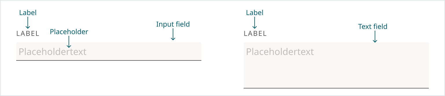
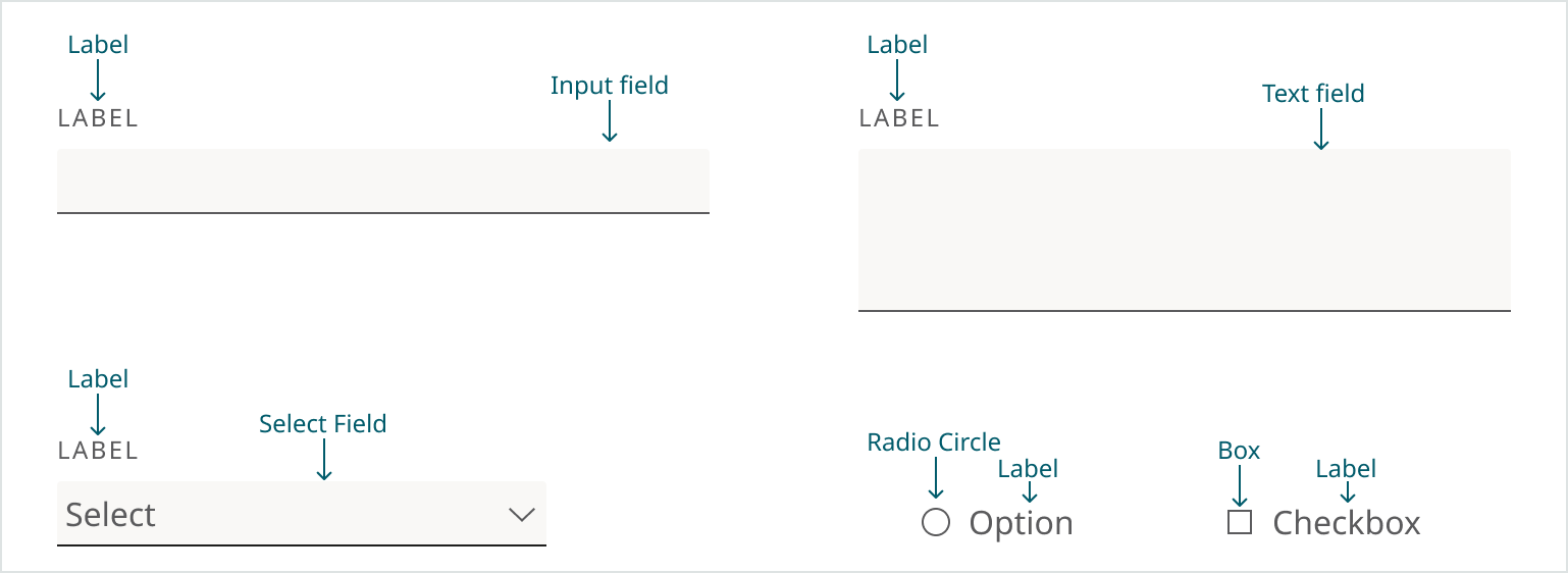
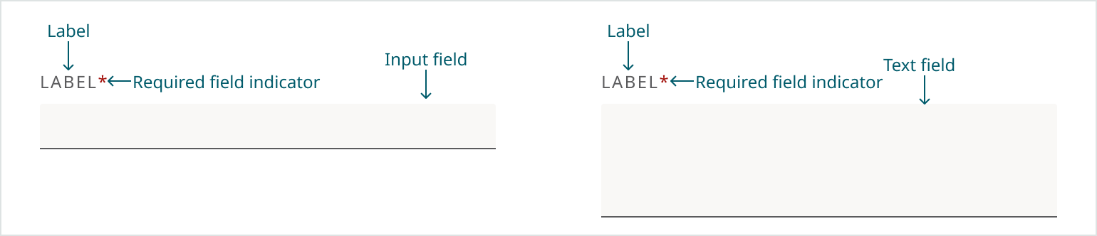
Labels
-
Ensure all form fields have associated labels.
-
Place labels near their associated input fields, preferably above, to ensure clear association. Guidelines for Labels can be found here.
-
Write concise and specific labels that make it clear what information users need to provide.
-
Don’t use placeholders as labels, as they disappear during typing and can cause confusion for users.
-
Prevent the keyboard from obscuring tooltips on mobile by adjusting the viewport when it’s active.
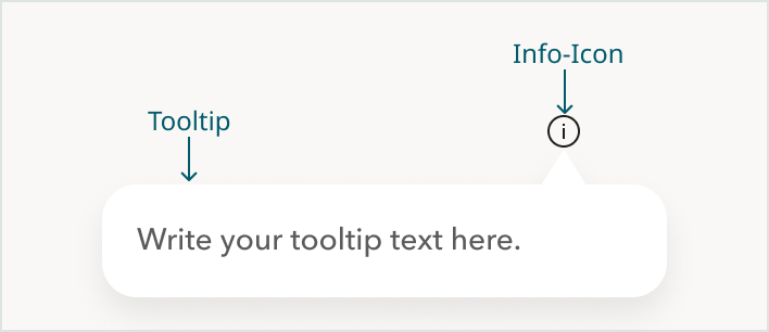
Tooltips
-
Add tooltips to explain complex fields or instructions.
-
If appropriate the Info-Icon can be used.
-
Tooltip can either be triggered by hovering or by clicking, depending on what makes sense for the specific element.
Validation
-
Validate user input when a field loses focus, the form is submitted, or a step is completed. Show clear error messages next to the affected fields. Ensure any dynamic content updates (such as error messages or modals) are properly announced to assistive technologies.
-
Data sanitation should be handled on the backend whenever possible. If user input needs to be adjusted, the changes should occur invisibly to avoid undermining the user’s sense of control.
Error Messages
- Provide clear and descriptive error messages with guidance for corrections. Position error messages near the affected field to make it easy for users to identify and correct the issue. Display error states clearly with outlines, color and text near the affected field.
| Bad Example | Good Example |
|---|---|
| Invalid input (Doesn’t explain what’s wrong) | Password must be at least 8 characters and include a number. (Includes length and required character type) |
| Password error (No information about the rules or how to fix the issue) | Enter a valid email like name@example.com. (Includes clear example) |
- Don’t rely on color alone to convey information. Always include text or icons to provide clarity. For example, error fields should not just be highlighted in red - they should also include an icon and a message explaining the error.
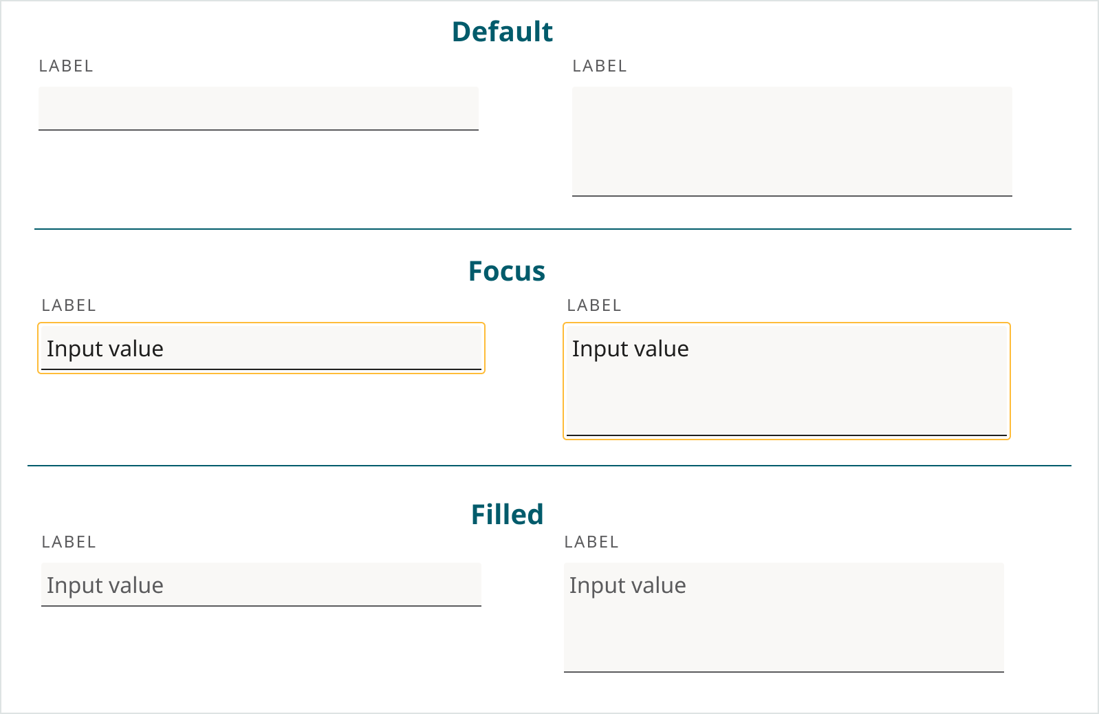
Status Indicators
-
Distinguish between active, inactive, and completed fields for better user orientation.
-
Add clear focus indicators, borders in select yellow, as defined in the design system, to show which field the user is currently interacting with.
Required Fields
-
Distinguish optional and required fields by marking required fields with a danger red asterisk at the end of the label. Avoid requiring unnecessary fields to reduce cognitive load.
-
If there are mostly required fields it’s also an option to add (Optional) to the label.
-
The decision for an asterisk for required fields or an (Optional) label should be consistent in a product/domain.
-
For short forms that can be quickly scanned, the submit button should be disabled until all required fields are filled out. In this case, include a tooltip on hover with the message: “Please complete all required fields before submitting.”
-
For longer forms, the submit button should remain active even if required fields are incomplete. This includes forms with conditionally revealed required fields, which can be confusing, as users may believe they’ve completed all required fields before triggering additional ones. When the user clicks submit, display error messages next to any unfilled required fields and automatically scroll to the first missing field. Additionally, show a toast notification at the top of the screen to provide immediate feedback, such as: “Some required fields are missing. Please check the form.” This ensures users receive both global and inline guidance.
Honeypots
Instead of CAPTCHAs we’re using Honeypots. Honeypot is a hidden input field that is invisible to human users but visible to bots. Since legitimate users don’t fill it out (they don’t see it), any submission that includes a value in this field is likely a bot and can be safely rejected.
Analytics
Track key performance indicators (KPIs) like:
- form completion rates
- time to complete
- field drop-off rates
- error-rate/validation failures
- repeat submissions
- time spent on each field.
Use heatmaps to identify where users focus or struggle within the form. Analyze form abandonment data to pinpoint issues and opportunities for improvement.
Tools for Analytics
Mouseflow, Datadog and Google Analytics can be used to track the KPIs. Data needs to be anonymous for the analysis
Best practices for each of the tools should be followed:
-
Mouseflow (Click here for best practices)
-
DataDog isn’t currently being used for tracking forms. New features will soon be activated which may make tracking of forms possible.
-
Google Analytics isn’t currently being used for tracking forms.